Thursday, October 29, 2015

AGATHA CHRISTIE Absent in the Spring

Agatha Christie 
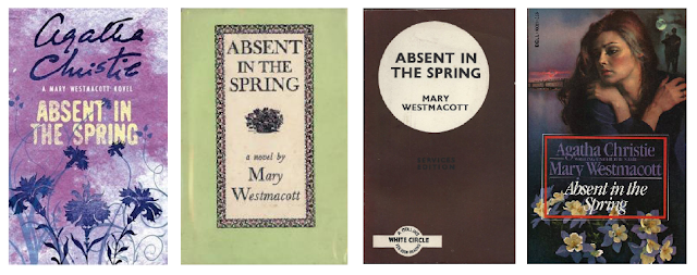
Absent in the Spring We have been given a one day brief to design a cover for our given Agatha Christie novel. Mine being 'Absent in the Spring'. The book was published in august 1944. The book is about a woman named Joan Scudamore as she is stuck between train rides on her way back to London from visiting Bagdad. With nothing t


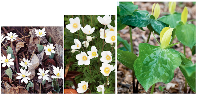
o do she lets her mind wander and reflects on uncomfortable truths about her life. As the book's title of the book is taken from Shakespeare's sonnet 98 'From you have I been absent in the spring'. I wanted to include an aspect of spring into my designs. I felt looking at typically spring flowers would create a recognisable and interesting cover for a book.   
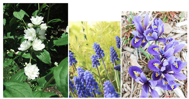


I began by creating these black pen drawings of the flowers, I wanted my drawings to be clear and recognising, I wanted my drawings to work graphically. I tried to keep each line totally joined as this would make it a lot easier in photoshop to colourise my images.


I began to look at the Japanese artist Katsushika Hokusai and his plant and animal drawings his beautiful attention to detail and fluent and free brush strokes create amazingly accurate and ornate drawings. The use of colour throughout Hokusai's work really makes the images feel real yet use simple flat colour. 


I coloured my images according to the images though I used a much more muted and pastel colour set this made for more intimate and soft images that I felt reflected the older target mark of people that read Agatha Christie novels. I really enjoyed creating these images and put a lot of consideration into colour combinations and really tried to get a feel for what colours seem to work well together.


After creating these plant images I began to see how the images looked with a title. At first I wanted to use very similar colour schemes with the text and the images, initially these designs seemed to reflect the book well yet I thought the title was unclear and I bit hard to read and over complicated. The colours seemed to alike and became a bit harsh on the eyes. 


I used a more simplistic and san serif typography as the designs became much more clear and easy to read form a far. 

These designs were much more legible and I liked the cream boarder as it allowed the designs to be much more simplistic. However the with the large text box I found it difficult to compose on the page that best complimented the illustrations.


These are my three final designs.
I experimented with the text at the top as I wanted the title to be as readable and simple ad possible thus getting the name of the book across straight away rather that something unclear and over complex. I am really pleased with how the designs came out, given the short amount of time I felt I created a well informed and interesting design. 

I have sent in my designs to the Guardian website and managed to have my designs feature on their website as shown.

Tuesday, October 27, 2015

Colour theory

We have been given the task to take come movie genre's and using the pantone colours chart find four relevant colours, one pair being fairly typical and the other something quite adventurous.
The task set out to improve our understanding of colour and that there is other options for picking colours and the pantone colours is a great way of choice established and confident colours. I feel this task has greatly improved not only my understanding of colour but also how I might approach using colours differently.

Sunday, October 25, 2015

Evaluation

The task was to redesign a chosen brand that had to be an international company that had a shop in leeds so we could conduct primary research to inform our design I began by looking around Trinity shopping centre to see what shops I felt I could create a appropriate and refined design and a company I felt needed to be rebranded.

 After comparing the Wasabi and Yo! Sushi logo I felt that the Yo! Sushi logo seemed a bit out of date and the design defiantly needed to be refreshed to compete with Wasabi and other asian style restaurants. I then started researching the Yo! Sushi brand and what made them different what their unique selling points were and how they compared to other sushi restaurants. I looked at the various platforms the company used for the branding and where the logo would be used like websites, Facebook, twitter, instagram and in different forms of print like menu's and pamphlets. I found most of the design was on black either a black background or dark imagery. I felt this didn't really reflect in there restaurant but quite the opposite in fact the interior was mainly white, bright, colourful and playful. I wanted this to reflect in my designs and try and create a more appropriate and readable design.

I began looking at examples of poster design that used both English and Japanese typography successfully together. Analysing and reflecting on what these designers had created. Mainly using one bright colour and then simple black and white designs created a sense of unity and order in the designs even tho they were complex and would usually be complicated and difficult to read. I felt this researched pushed my ideas and helped me formulate more detailed and informed design responses.

I then began to create some designs using a similar layout to the old design using the same colour pallet but changing the typography pretty drastically to create more modern and simplistic designs. The bold San Serif photo straight away made it more recognisable and clean cut however I felt the colours tho they were the same as the old Yo! Sushi logo it didn't reflect the ethos of the brand and the fact they were serving fresh high quality sushi. We had an interim critic on our progress so far and what brand we had pricked and initial designs and research we had done. Discussing what I had done so far we spoke about the designs not really feeling right and not reflecting the brand, and that the colours seemed very bland and especially the black felt overpowering and limited the designs.

I took these comments and tried to act on them to create some more informed and appropriate branding that reflected the identity i wanted to convoy in my designs. I looked at the book 'Commercial design of Japan' to form a better basis on my designs the work in this book was a little too illustrative for this type project but helped me with colour and getting more of a feel for more traditional Japanese design techniques. I then started designing the more finalised logos with a real focus on type style, colour and spacing. These designs were much more effective and felt more refreshing and iconic. I used Din type face mainly lower can in italic to create dynamic yet simplistic typography. I began experimenting with a stencil effect on this type to add another level of detail yet trying to remain legible and engaging. I felt the final compositions were extremely versatile and would work on a range of scales as this was imperative for the branding. I experimented alot with variations of stroke and colour to find the most appropriate and consistent design using the existing Yo! Sushi colour set taken form the different dishes created great results and the colours were memorable and iconic for the restaurant. Overall I felt my work on this project grew better as I conducted more research and received feed back on my design and naturally my designs became alot more immersive and engaging by the end. I felt I created work that answered the brief and was well thought out reflected my chosen brand.

Feedback


I have received feed back on my Yo! Sushi branding from a various different people including my tutors and class mates. To make giving the feed back easier I wrote down what my intentions were in terms of the brief and what I wanted to achieve in my designs, this being; to create a more distinct and legible brand that shows what the restaurant is clearly and creating a more refreshing memorable brand. In addition to this I wrote down a five questions for them to answer about the designs and whether it is effective.

Firstly I asked 'To what effect has the typography worked considering spacing and legibility?'
Mainly people felt the kerning and spacing created a easy to read and understandable brand and the white space around the type allowed the logo to breath. A couple of people felt that the 3D designs would be at risk of seeming overly detailed and unclear at a smaller scale. I feel this is defiantly an important point and something that was integral to the design. Overall I feel people thought that the typeface choice, lettering and spacing reflected the japanese branding altogether.

The second question ' Do you think the logo would work on a range of platforms and scales?
From the feed back I found that the simplicity of the logo made it translatable onto a lot of scales and sizes and that the detail would not be lost in smaller scale.

The third question 'Does the colouring reflect the 'Yo! Sushi' brand and remain recognisable for the target audience and if yes how?'
As there was many different colours for the five finalised designs there was a large range of feedback for this question. With the red circle logo they felt it reflected the japanese branding to achieve with the Japanese flag and the rising sun idea. With the use of vivid blues and greens taken originally from the colours of the different dishes at yo sushi they felt it showed a refreshing and clean design that was 'simple, minimal and trendy'.

The forth question 'Does the composition of the typography inside the circle seem appropriate for the brand?'
The feed back commented generally about the even proportions and the use of appropriate spacing between the circle and the typography. They also ask whether the typography could have been moved up a little as their was possibly to much space at the top of the circle I felt this was a good point as in the final designs the positioning of 'yo!' variated a lot and may have been better more consistent.

Which of the five designs is most appropriate and why?
For the yellow/orange design I had two people say they preferred this design as it seemed more cultured and was more consistent with the original design.
And for the blue design they felt it worked well with the 3d type and the letters were arranged clearly.
For the blue and green overlay design in all lower case the comments stated that it would create a more bespoke confident modern brand mark.
And finally with the first red logo it may been the most obvious response as it reflects the Japanese identity of the brand.

This feedback is all very useful and can defiantly help me reflect on this project and take the points made into future projects. Reflection and constructive criticism can really help in pushing ideas in graphic design.


Thursday, October 22, 2015


Yo! Sushi Designs


Gif of my gradual change of designs.


After receiving feedback on my initial designs for Yo! Sushi that the designs didn't really reflect the brand of Yo sushi I began to rethink my ideas and start again in the design process. I started with a circle rather than the square this is resembling the Japanese flag a red circle in the middle of a white rectangle it is a very memorable image. Additionally I felt the general shape of the makizushi sushi is circular and is a familiar sushi dish.

Using the Din typeface mainly in italic lower case with only the Y of yo! in upper case I felt this type face is clear and very refreshing for the brand and could be enhanced and changed to great effect. I then began to compose the typography on the page to fit with the circular shape and trying to make the japanese writing compliment the other typography. I felt that the stencil style remained readable and seemed like neon lights used on the Yo sushi website. I used the colours of the dishes used in the restaurant and experimented with different arrangements on the page trying to make the logo as distinct as possible. 

I then duplicated the typography and created a double image of type and adjusted it try and keep it legible and cohesive with the rest of the type. This design I felt had good aspects to it as it was quite different and would stand out and additionally it would greater display the idea of a neon billboard design. I decided that the design was too difficult to read and wouldn't work on a very large range of different scales and mediums. I felt wanted to create a 3d effect on the typography to emphasis this billboard idea  I then tried to find the appropriate stroke and colour for the typeface that reflected the slick and more modern feel for the logo and didn't seem out of place with the rest of the type. While experimenting with colour I tried large variations of combinations of colours for both the back ground the fill of the type and the stroke. Looking for what looked clear and presentable and wasn't too decretive. I liked the Blue on white using the the standard cyan colour I felt over complicating the colour combinations for a logo that needed to stand out so a readable and recognisable colour would be appropriate. I looked at using both upper and lower case Y as the displayed a different feel to the design. The upper case seemed more of a shout with the exclamation mark on the end and on the other hand the lower case had more of a approachable and child friendly feel that is definitely important to the yo sushi restaurant.

Tuesday, October 20, 2015

Commercial design of Japan

Commercial design of Japan
I wanted to conduct some futher primary research into Japanese graphic so I went to the libary and looked up 'Japanese Graphics' and Japanese Design' when i looked at the books avalible they all seemed to have a common theme of product design and inteior design. However I found this really small book 'Commerical design of Japan'. It gives a brilliant insight into some tractial and ornate piece of Japanese graphics. I love the small details throughout the designs and the beautiful colour combinations. I think in terms of colour theory this is something I have struggled with in this Yo! Sushi project so far I need to look at what has worked well within this book and try to transfer certain colour styles into my own designs.

Whitney Museum Rebranding Analysis


We have been asked to look into the redesign of the Whitney museum in New York and analyse what we think has worked well and how they have reached the graphical outcome.

Firstly the idea behind the rebranding came from their move from the old building to a totally new modern building designed by famed italian architect Renzo Piano. The new building uses grand shapes and extended prepositions to really stand out from the other buildings around it.

The design studio Experimental Jetset were given the task to design new identity. The large W is a very versatile design it is modelled and adapted to fit many different white spaces and forms the basis for the rest of the design identity. The typography used for the large bold text is 'Neue Haas Grotesk' reflecting very much Helvetica a very popular and adaptable typeface that has been used for all the New York subway system so reflects the city which was important to the designers. The Whitney exhibit’s rebrand is effective as it reflects the museum even though it is simplistic. The minimalism and simplicity creates a sleek design and you can transfer the logo effectively onto signage and outer design elements effectively but extending it and changing the width depending on the word. One of the inspirations was a specific piece of work by Ad Reinhardt in a comic strip from the 1940’s, a wonderful ‘typology of lines’. Additionally is the concept of a derive from one point to the next through a city, getting from A to B shown with the zig zag line. Another design concept is this idea of drawing a time line of art history with the line and showing the zig zag as being both in the future and the past at the same time and reflecting from one to the other. The new logo also reflects the modernism of the new building. The white space gives examples of the gallery’s work more impact and makes it more striking. It’s simplistic but has so much reasoning and justification through the context which ads more significance and purpose to the design. The simple logo can be incorporated into direction signage and other graphic design and it is a flexible platform for different texts. 


Monday, October 19, 2015

Initial designs


I have begun my initial design ideas. I started with the simple orange square that is usually recognisable with Yo! Sushi I wanted to look at the effect of typography on the overall feel for the image using bold San Serif typography creates already a more modern and clear logo. I looked at using Italic font to add a real emphasis on the 'Yo!' of Yo! Sushi. After looking at simple white and black on orange I wanted to see the effectiveness of various different colours previously used in the Yo! Sushi logos. I felt that the orange background with pink text were to similar in tone and became unclear. The black background with the orange text I feel is not at all engaging and the black is very uneasy on the eye and doesn't reflect the fresh food feel to Yo! Sushi.
I began to look at how it worked with the japanese typography but felt it was a little illegible and I needed to rethink this in my next set of design ideas. Overall I am not very happy with the clarity and general look of these designs.

Sunday, October 18, 2015

Yorkshire Sculpture Park

We had a to present our Yorkshire Sculpture Park logo's to a group talking about what we had created and we discussed each of our design decisions. My presentation went very well and I feel I talked about my work in a confident and clear way.

After each person we each wrote down notes on their presentation these are some examples of what the group thought of my work.

'Some good research into Pompidou logo although would be beneficial to look at a broader range of research.' 

'Good design development and critiquing of designs.'

'Good appreciation of scale.'

'Try and experiment with more simplified shapes from drawings to show it works in different shapes.'

'Looking at established, successful logos to influence and inform your practice was good, considered design decisions. Really detailed design process throughout.'

'Good background research, great ideas, lots of development- Great drawings! Too intricate/ detailed would get lost in small scale.'

'Good versatility with the simple from far but detailed from close up.'

Overall the feed back was very positive but I feel I could have been more constructive to have some more constructive criticism just to try and improve my work in the future. I think the main thing that was spoke about was if the logo could work on a both a large and small scale. I found this kind of feed back very useful and I think doing this more regularly will definitely improve my practice and ability to self criticise my work.

Thursday, October 15, 2015

Yorkshire Sculpture Park


I began to create some designs from my drawings using Indesign. I wanted to look closely at composition, scale and line. 
 

I began by really thinking about my experience of Yorkshire Sculpture Park and what kind of people visit there, what the target market is and what kind of logo would suit the general feel for the park.

I started very simply just using the outlines of each sculpture to try and emulate the overall shape.


I experimented a lot with very simplistic designs to try and keep make the logo appeal to everyone as the park has a very large target audience, It is visited by a lot of adults, over 60's and both students and school kids on trips. The beautiful surroundings and sculpture make for a lot of visiters. There are a few very iconic sculptures in the permeant collection by the likes of Henri Moore, Barbara Hepworth and Joan Miro. I felt these would be the most appropriate to use as the would create a more memorable brand.


I decided to go back to my original drawings and retouch them on Photoshop to see if they would work better and reflect the brand better. I felt the more detailed hand drawn images would be a lot more tactical and personal. I looked at the composition very closely and made sure it had the perfect spacing and looked right in the circle.
I then changed the colouring of the images to make them stand out on the page more and keep the detail of the drawn line. I really feel the images were much more clear and worked better in a large range of sizes. I think that changing and experimenting as much as possible has really pushed this project further and further and I feel I have created a symbol that reflects the park well and is recognisable in the context.